TERME SIRMIONE
Realisation of a concept book for the group’s stores.
The concept expresses the corporate philosophy by welcoming the consumer into a comfortable space that recalls the elements of water and mud in its forms and finishes as well as the company’s constant quest to find innovative solutions in terms of wellbeing and personal care.
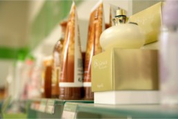
The materials used for the sales outlets recall the elements that characterise the essence of the spa through the use of warm shades of mud, given various finishes, and more neutral shades of water.
The materials and colours selected produce a refined atmosphere which recalls the uniqueness of the Terme di Sirmione product with its hyper thermal mineral water and healing muds, flanked by advanced scientific and technological research. It is a sophisticated and welcoming style which – by the use of indigo blue, which stimulates the senses of hearing, sight and smell but also brings serenity and calmness, and the natural shades of the healing muds and clays, slightly rough to the touch so as to give the walls more texture, rendering them undulating and elegant – reproduces the essence of the brand and communicates the product.
The materials highlight the luxuriousness of the Concept and valorise the product displayed.
Indeed, the product is the core element and is accentuated by a combination of materials and display configurations that can be adapted to suit any space.
The perimeter walls of the sales outlet are transformed into display cabinets containing inbuilt niches for the product and fully-integrated storage spaces. The niches are painted white to tidy the space and accent the packaging.
Touchscreens integrated in the countertops, video walls and screens backing the display cabinets provide descriptions of the services the spa offers and insight into the company’s ongoing research and innovation.
FIELDRetailNAMETerme Sirmione YEAR2016LOCATIONItaly